HTML – CRUD example with BOOTSTRAP4

This example of CRUD signup is only the visual part with HTML and BOOTSTRAP4.
Step by step I’ll show you how to create the next screen composed of two tabs.

  1. List to show all created users
  2. form for the creation of users.
USER CRUD
USER CRUD

We will rely on the structure of files and images of the previous tutorial of HTML (login tutorial).
Github Repository: Click here

Step by step:

1. Create files

  1. User-form. html (in the Root).
  2. static/CSS/user-form. css

2. Basic structure user-form. html

<!DOCTYPE html>
<html lang="en" xmlns:th="http://www.thymeleaf.org"></html>
<head></head>
	<title>User Information and Form</title>
	
	<!--JQUERY-->
	<script></script>
		src = "https://ajax.googleapis.com/ajax/libs/jquery/3.3.1/jquery.min.js" >
	
	<!-- FRAMEWORK BOOTSTRAP para el estilo de la pagina-->
	<link rel="stylesheet" rel="stylesheet"></link rel="stylesheet">
		href = "https://maxcdn.bootstrapcdn.com/bootstrap/4.0.0/css/bootstrap.min.css" >
	<script></script>
		src = "https://maxcdn.bootstrapcdn.com/bootstrap/4.0.0/js/bootstrap.min.js" >
	<script></script> 
		src = "https://code.jquery.com/jquery-3.2.1.slim.min.js" integrity = "sha384-KJ3o2DKtIkvYIK3UENzmM7KCkRr/rE9/Qpg6aAZGJwFDMVNA/GpGFF93hXpG5KkN" crossorigin = "Anonymous" >
	<script></script> 
		src = "https://cdnjs.cloudflare.com/ajax/libs/popper.js/1.12.9/umd/popper.min.js" integrity = "sha384-ApNbgh9B + Y1QKtv3Rn7W3mgPxhU9K/ScQsAP7hUibX39j7fakFPskvXusvfa0b4Q" crossorigin = "Anonymous" >
	
	<!-- Los iconos tipo Solid de Fontawesome-->
	<link rel="stylesheet" rel="stylesheet"></link rel="stylesheet">
		href = "https://use.fontawesome.com/releases/v5.0.8/css/solid.css" >
	<script src="https://use.fontawesome.com/releases/v5.0.7/js/all.js"></script>
	
	<!-- Nuestro css-->
	<link rel="stylesheet" type="text/css" href="static/css/user-form.css" rel="stylesheet" type="text/css" href="static/css/user-form.css"></link rel="stylesheet" type="text/css" href="static/css/user-form.css">
		Th: href = "@ {/css/user-form.css}" >


<body></body>
	<!-- Mucho mucho codigo aqui-->


This is the structure of our page, the rest of the code examples should be added within the tags<body></body>, unless otherwise indicated.

3. User-form. CSS Styles

Body
    Background: URL (.. /img/background.jpg) No-repeat center center fixed;
    background-size: cover;
}

. Main-section {
    Margin: 0 Car
    Margin-top: 5%;
}
Card
	Opacity:. 95;
}
. Card-Body {
    background-color: #d1d3d6;
    Box-shadow: 0px 0px 3px #848484;
}

Label
	FONT-weight: bold;
}

. Nav-Tabs. Nav-item a:not (. Active) {
	background-color: #d1d3d6;
}

. Nav-Tabs {
	Border-bottom: 0px;
}

There is nothing unusual in the style that needs explanation other than the line 22, where I add background color to the tab that is not selected.

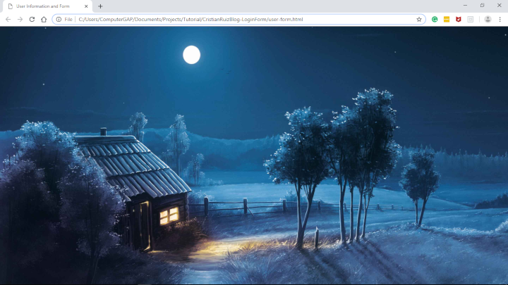
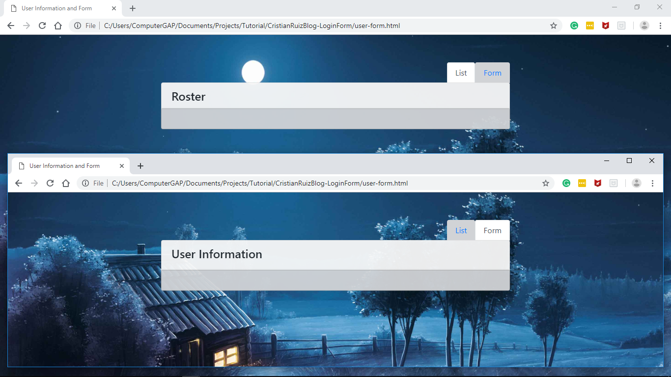
If you did everything right you will have a screen similar to the following image. If you need help check the tutorial #1 HTML:
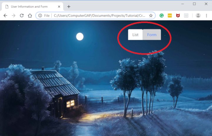
CRUD USER PART 1 
Structure
CRUD USER FORM PART 1

4. Tabs

We will create a container div and a Div Main-section to keep our content focused. Then we will create a list that will serve as tabs (tabs) right-aligned.


<span class="token tag"><span class="token tag"><span class="token punctuation"><</span>div </span>c<span class="token attr-name">lass="</span><span class="token attr-value"><span class="token punctuation">c</span><span class="token punctuation">on</span>tainer"></d<span class="token punctuation">i</span></span><span class="token punctuation">v></span></span>
	<span class="token tag"><span class="token tag"><span class="token punctuation"><</span>div</span> <span class="token attr-name">class</span><span class="token attr-value"><span class="token punctuation">=</span><span class="token punctuation">"m</span>x-auto col-sm-8 main-section" i<span class="token punctuation">d</span></span>=<span class="token attr-name">"m</span><span class="token attr-value"><span class="token punctuation">yT</span><span class="token punctuation">a</span>b" ro<span class="token punctuation">l</span></span>e<span class="token attr-name">="tab</span><span class="token attr-value"><span class="token punctuation">l</span><span class="token punctuation">i</span>st"></d<span class="token punctuation">i</span></span><span class="token punctuation">v></span></span>
		<span class="token tag"><span class="token tag"><span class="token punctuation"><</span>ul</span> <span class="token attr-name">class=</span><span class="token attr-value"><span class="token punctuation">"</span><span class="token punctuation">n</span>av nav-tabs justify-content-end"></<span class="token punctuation">u</span></span><span class="token punctuation">l></span></span>
			<span class="token tag"><span class="token tag"><span class="token punctuation"><</span>li</span> <span class="token attr-name">class="</span><span class="token attr-value"><span class="token punctuation">n</span><span class="token punctuation">a</span>v-item"></<span class="token punctuation">l</span></span><span class="token punctuation">i></span></span>
			<span class="token tag"><span class="token tag"><span class="token punctuation"><</span>a</span> <span class="token attr-name">class</span><span class="token attr-value"><span class="token punctuation">=</span><span class="token punctuation">"</span>nav-link active<span class="token punctuation">"</span></span> <span class="token attr-name">id</span><span class="token attr-value"><span class="token punctuation">=</span><span class="token punctuation">"</span>list-tab<span class="token punctuation">"</span></span> <span class="token attr-name">data-toggle</span><span class="token attr-value"><span class="token punctuation">=</span><span class="token punctuation">"</span>tab<span class="token punctuation">"</span></span> <span class="token attr-name">href</span><span class="token attr-value"><span class="token punctuation">=</span><span class="token punctuation">"</span>#list<span class="token punctuation">"</span></span> <span class="token attr-name">role</span><span class="token attr-value"><span class="token punctuation">=</span><span class="token punctuation">"</span>tab<span class="token punctuation">"</span></span> <span class="token attr-name">aria-controls</span><span class="token attr-value"><span class="token punctuation">=</span><span class="token punctuation">"</span>list<span class="token punctuation">"</span></span> <span class="token attr-name">aria-selected</span><span class="token attr-value"><span class="token punctuation">=</span><span class="token punctuation">"</span>false<span class="token punctuation">"</span></span><span class="token punctuation">></span></span>List<span class="token tag"><span class="token tag"><span class="token punctuation"></</span>a</span><span class="token punctuation">></span></span>
			<span class="token tag"></span>
			<span class="token tag"><li class="nav-item"></li></span>
			<span class="token tag"><span class="token tag"><span class="token punctuation"><</span>a</span> <span class="token attr-name">class</span><span class="token attr-value"><span class="token punctuation">=</span><span class="token punctuation">"</span>nav-link<span class="token punctuation">"</span></span> <span class="token attr-name">id</span><span class="token attr-value"><span class="token punctuation">=</span><span class="token punctuation">"</span>form-tab<span class="token punctuation">"</span></span> <span class="token attr-name">data-toggle</span><span class="token attr-value"><span class="token punctuation">=</span><span class="token punctuation">"</span>tab<span class="token punctuation">"</span></span> <span class="token attr-name">href</span><span class="token attr-value"><span class="token punctuation">=</span><span class="token punctuation">"</span>#form<span class="token punctuation">"</span></span> <span class="token attr-name">role</span><span class="token attr-value"><span class="token punctuation">=</span><span class="token punctuation">"</span>tab<span class="token punctuation">"</span></span> <span class="token attr-name">aria-controls</span><span class="token attr-value"><span class="token punctuation">=</span><span class="token punctuation">"</span>form<span class="token punctuation">"</span></span> <span class="token attr-name">aria-selected</span><span class="token attr-value"><span class="token punctuation">=</span><span class="token punctuation">"</span>true<span class="token punctuation">"</span></span><span class="token punctuation">></span></span>Form<span class="token tag"><span class="token tag"><span class="token punctuation"></</span>a</span><span class="token punctuation">></span></span>				   	
			<span class="token tag"></span>
		<span class="token tag"></span>
		<span class="token tag"><span class="token tag"><span class="token punctuation"><</span>div</span> <span class="token attr-name">class=</span><span class="token attr-value"><span class="token punctuation">"</span><span class="token punctuation">t</span>ab-content" i<span class="token punctuation">d</span></span>=<span class="token attr-name">"m</span><span class="token attr-value"><span class="token punctuation">y</span><span class="token punctuation">Ta</span>bContent"></d<span class="token punctuation">i</span></span><span class="token punctuation">v></span></span>
			<span class="token tag"><span class="token tag"><span class="token punctuation"><</span>div</span> <span class="token attr-name">class</span><span class="token attr-value"><span class="token punctuation">=</span><span class="token punctuation">"</span>tab-pane fade show active" <span class="token punctuation">i</span></span>d<span class="token attr-name">="</span><span class="token attr-value"><span class="token punctuation">l</span><span class="token punctuation">i</span>st" r<span class="token punctuation">o</span></span>l<span class="token attr-name">e="t</span><span class="token attr-value"><span class="token punctuation">a</span><span class="token punctuation">b</span>panel" ar<span class="token punctuation">i</span></span>a<span class="token attr-name">-labelledby="lis</span><span class="token attr-value"><span class="token punctuation">t</span><span class="token punctuation">-</span>tab"></d<span class="token punctuation">i</span></span><span class="token punctuation">v></span></span>
			<span class="token tag"></span>
			<span class="token tag"><span class="token tag"><span class="token punctuation"><</span>div</span> <span class="token attr-name">class</span><span class="token attr-value"><span class="token punctuation">=</span><span class="token punctuation">"</span>tab-pane fade"<span class="token punctuation"> </span></span>id<span class="token attr-name">="</span><span class="token attr-value"><span class="token punctuation">f</span><span class="token punctuation">o</span>rm" <span class="token punctuation">r</span></span>o<span class="token attr-name">le="t</span><span class="token attr-value"><span class="token punctuation">a</span><span class="token punctuation">b</span>panel" a<span class="token punctuation">r</span></span>i<span class="token attr-name">a-labelledby="for</span><span class="token attr-value"><span class="token punctuation">m</span><span class="token punctuation">-</span>tab"></d<span class="token punctuation">i</span></span><span class="token punctuation">v></span></span>
			<span class="token tag"></span>
		<span class="token tag"></span>
	<span class="token tag"></span>
<span class="token tag"><span class="token tag"><span class="token punctuation">
</span></span></span>
Markup
CRUD USER PART 2 tabs (tabs)

Explain each important bootstrap class used, start with the classes used by the wrappers DIVs (divs that encapsulates the page):

  • Container: necessary to be able to use the famous bootstrap grid system
  • MX-Auto: Center the DIV by adding auto margin to the left and right side
  • Col-SM-8: Uses 8 cells of the 12 used by the grid Sistem.
  • Main-section: class defined to customize our CSS.

Style classes for tabs:

  • Nav nav-Tabs: Transforms the list <ul>from vertical to horizontal and adds the “box” style.</ul>
  • Justify-Content-end: Aligns the tabs to the right.
  • Nav-Item NAV-Link: indicates that<li>It’s a tab and it gives you the necessary style.</li>
  • Active — indicates that the tab will be selected when displaying the page.
  • tab-Content: The div with this class will show and contain the contents for the tabs.
  • tab-Pane Fade show: Serves to fade-in, Osea Show or appear the content gradually.

To make the tabs work you have to do something important, make sure that the nav-link href is equal to the div ID with the tab-pane class.

5. Cards

I’ll create the contents of both tabs and make sure it works. For this we will use a bootstrap component known as “cards”. This consists of two parts, the header which is where the title and body showing the content of that card.

The following code will be added within the first and second Div with tab-pane class correspondingly
. Complete file here

5.1. List Card

<div class="card"></div>
	<div class="card-header"></div>
		<h4>Roster</h4>
	
	<div class="card-body"></div>
		<!-- Lista de usuarios-->
	

5.2. User Form Card

<div class="card"></div>
	<div class="card-header"></div>
		<h4>User Information</h4>
	
	<div class="card-body"></div>
		<!-- Formulario de usuarios-->
	

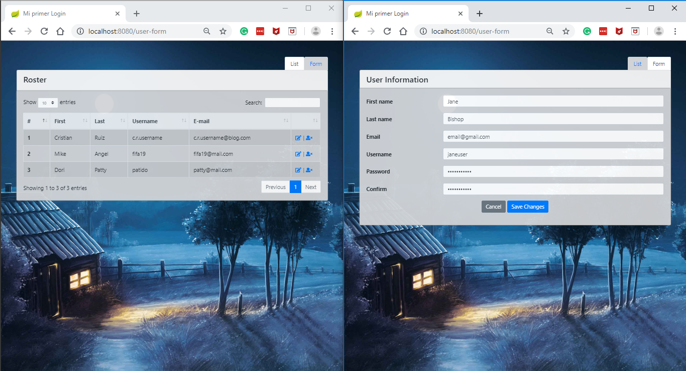
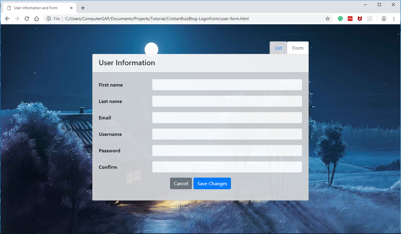
This is the screen that you will see if everything goes well to this point. Click on each tab and the title of the card should change.
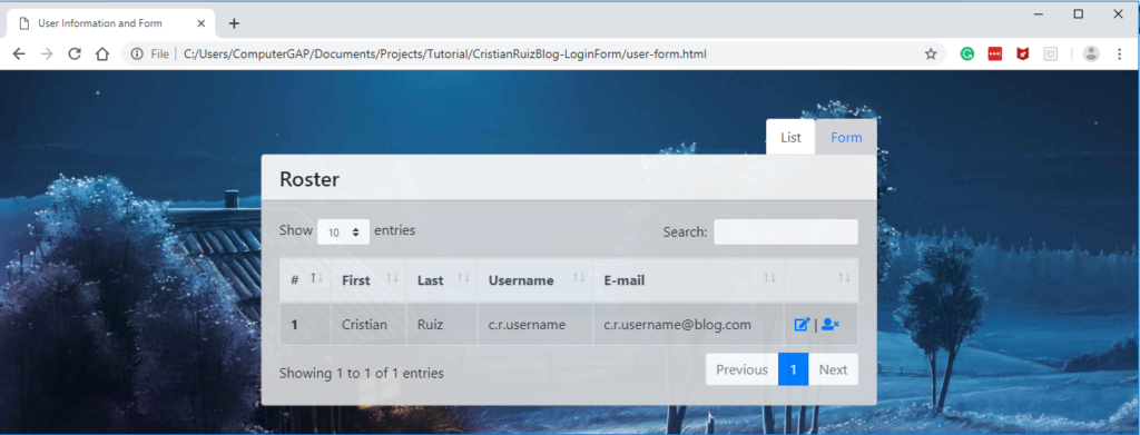
CRUD USER PART 3 tabs (tabs)

6. User List

As you know we use BOOTSTRAP4 to “make up” our list, but to be able to interact with the table use the library https://datatables.net/ to sort by column and do searches and things like that.

You can download and add the library to your project, but I use them online. Add the following code between the tags<head></head>.

<!-- DATA TABLE -->
<script src="https://cdn.datatables.net/1.10.19/js/jquery.dataTables.min.js"></script>
<script src="https://cdn.datatables.net/1.10.19/js/dataTables.bootstrap4.min.js"></script>
<link rel="stylesheet" href="https://cdnjs.cloudflare.com/ajax/libs/twitter-bootstrap/4.1.1/css/bootstrap.css">	
<link rel="stylesheet" href="https://cdn.datatables.net/1.10.19/css/dataTables.bootstrap4.min.css">

Once already added the libraries we proceed with the HTML that should go inside the first card-body. We will use a div with the class table-responsive for our DataTable to be responsive.

Then we will use the tag<table>With the following classes:</table>

  1. Table-bordered: gives borders to all cells and the table in general.
  2. Table-Hover: Gives the effect of selected to each row when the mouse passes over.
  3. Table-striped: gives a different background color to the odd and even rows.
  4. Table: Gives Bootstrap styles

Important so that the library can identify in which table implement the functionality is necessary to add the id attribute, in my example I have it in the following way id = “UserList”.

Now we’ll add the header of the table with the <thead></thead> label and the THEAD-light class. And then inside the label <tbody></tbody> you’ll put all the content.

You can support yourself with the official documentation.
HTTPS://getbootstrap.com/docs/4.0/content/tables/


<div class="table-responsive"></div>
	<table id="userList" class="table table-bordered table-hover table-striped"></table>
		<thead class="thead-light"></thead>
		<tr></tr>
			<th scope="col">#</th>
			<th scope="col">First</th>
			<th scope="col">Last</th>
			<th scope="col">Username</th>
			<th scope="col">E-mail</th>
			<th></th>
		
		
		<tbody></tbody>
		<tr></tr>
			<th scope="row">1</th>
			<td>Cristian</td>
			<td>Ruiz</td>
			<td>C.R. Username</td>
			<td>C.r.username@blog.com</td>
			<td></td>
				<a href="#"><i class="fas fa-edit"></i></a>|<a href="#"><i class="fas fa-user-times"></i></a>


To finish, we will convert the regular table to a dataTable. Adds the following code after the libraries added earlier at the beginning of this point.

<script type="text/javascript"></script>
    $ (document). Ready (function () {
        Make sure that the ID you gave to the table is equal to the text after the symbol #
        $ (' #userList '). DataTable ();
    } );
CRUD user PART 4 user LIST

7. User Form

In this part there is nothing to say that has not been said in the previous tutorial. Add this code in the second card-body


<form class="form" role="form" autocomplete="off"></form>
	<div class="form-group row"></div>
		<label class="col-lg-3 col-form-label form-control-label">First Name</label>
		<div class="col-lg-9"></div>
			<input class="form-control" type="text">
		
	
	<div class="form-group row"></div>
		<label class="col-lg-3 col-form-label form-control-label">Last</label>
			Name
		<div class="col-lg-9"></div>
			<input class="form-control" type="text">
		
	
	<div class="form-group row"></div>
		<label class="col-lg-3 col-form-label form-control-label">Email</label>
		<div class="col-lg-9"></div>
			<input class="form-control" type="email">
		
	
	<div class="form-group row"></div>
		<label class="col-lg-3 col-form-label form-control-label">Username</label>
		<div class="col-lg-9"></div>
			<input class="form-control" type="text">
		
	
	<div class="form-group row"></div>
		<label class="col-lg-3 col-form-label form-control-label">Password</label>
		<div class="col-lg-9"></div>
			<input class="form-control" type="password">
		
	
	<div class="form-group row"></div>
		<label class="col-lg-3 col-form-label form-control-label">Confirm</label>
		<div class="col-lg-9"></div>
			<input class="form-control" type="password">
		
	
	<div class="form-group row"></div>
		<div class="col-lg-12 text-center"></div>
			<input type="reset" class="btn btn-secondary" value="Cancel">
			<input type="button" class="btn btn-primary" type="button" class="btn btn-primary"></input type="button" class="btn btn-primary">
				Value = "Save changes" >


CRUD user PART 5 user FORM

Code of the Project

Https://github.com/cruizg93/CristianRuizBlog-LoginForm/tree/user-form

Deja un comentario

Tu dirección de correo electrónico no será publicada. Los campos obligatorios están marcados con *